Equals Money
Making complex money movement feel simple, fast and controlled.
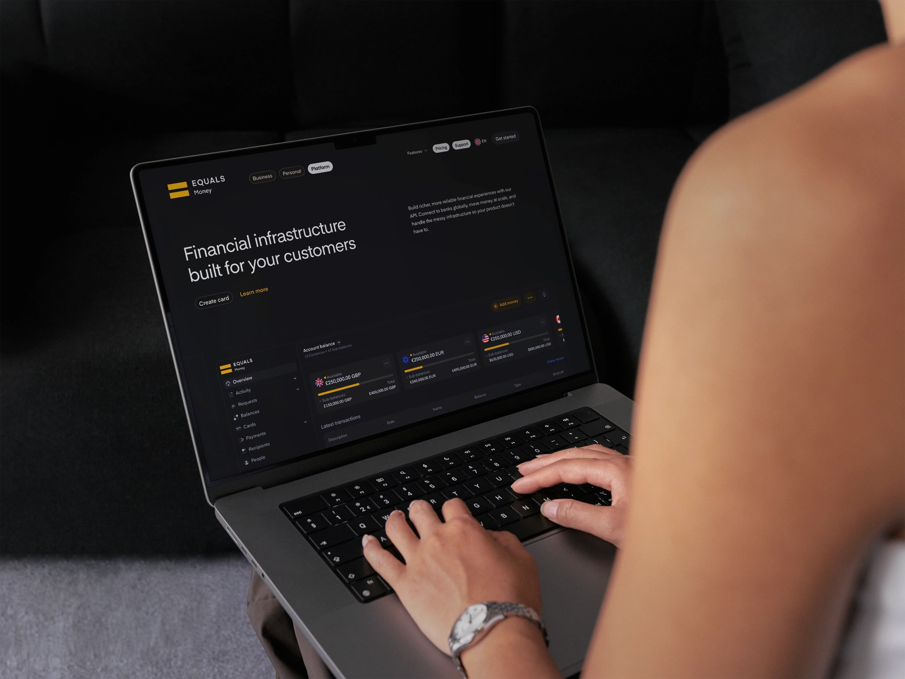
Services
brand design
art direction
brand strategy
Client
Equals Money
Location
LONDON
Year
2022-2026
Info
quals Money helps businesses move money internationally through multi-currency accounts and payment infrastructure. With four brands under one roof, the challenge wasn't creating an identity but keeping it coherent. I owned the brand system: defining its core elements, setting how it flexes between brands, and making sure it held up consistently across web, product and marketing.
impact
A brand refresh and integrated campaign system that helped drive group revenue from £95.7m to £131.7m year on year.
BRAND IDENTITY
MY ROLE:
When I joined, the Equals brand felt disjointed. Visual language varied across touchpoints, guidelines were loose, and there was no cohesive system tying our work together. I led a full refinement of the brand, rebuilding the guidelines from the ground up to create a single source of truth the wider team could confidently design against. This included a refreshed library of background patterns, tightened grid systems and consistency rules, refined colour application, and a properly governed asset system.
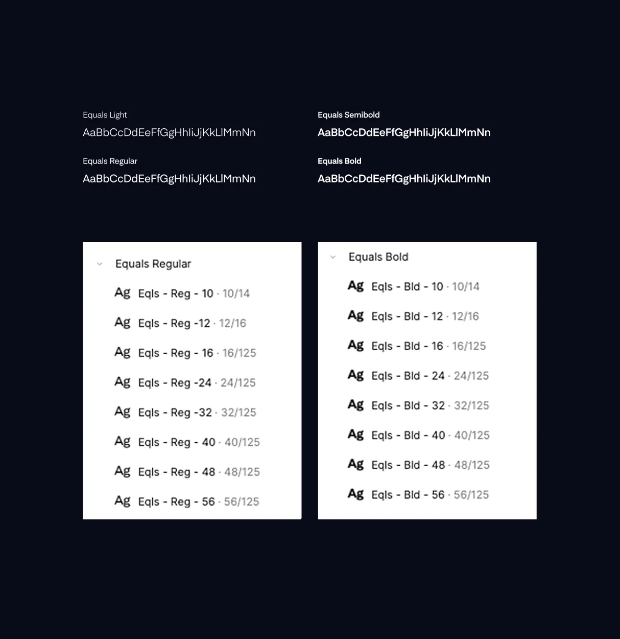

ILLUSTRATION SYSTEM
mY ROLE
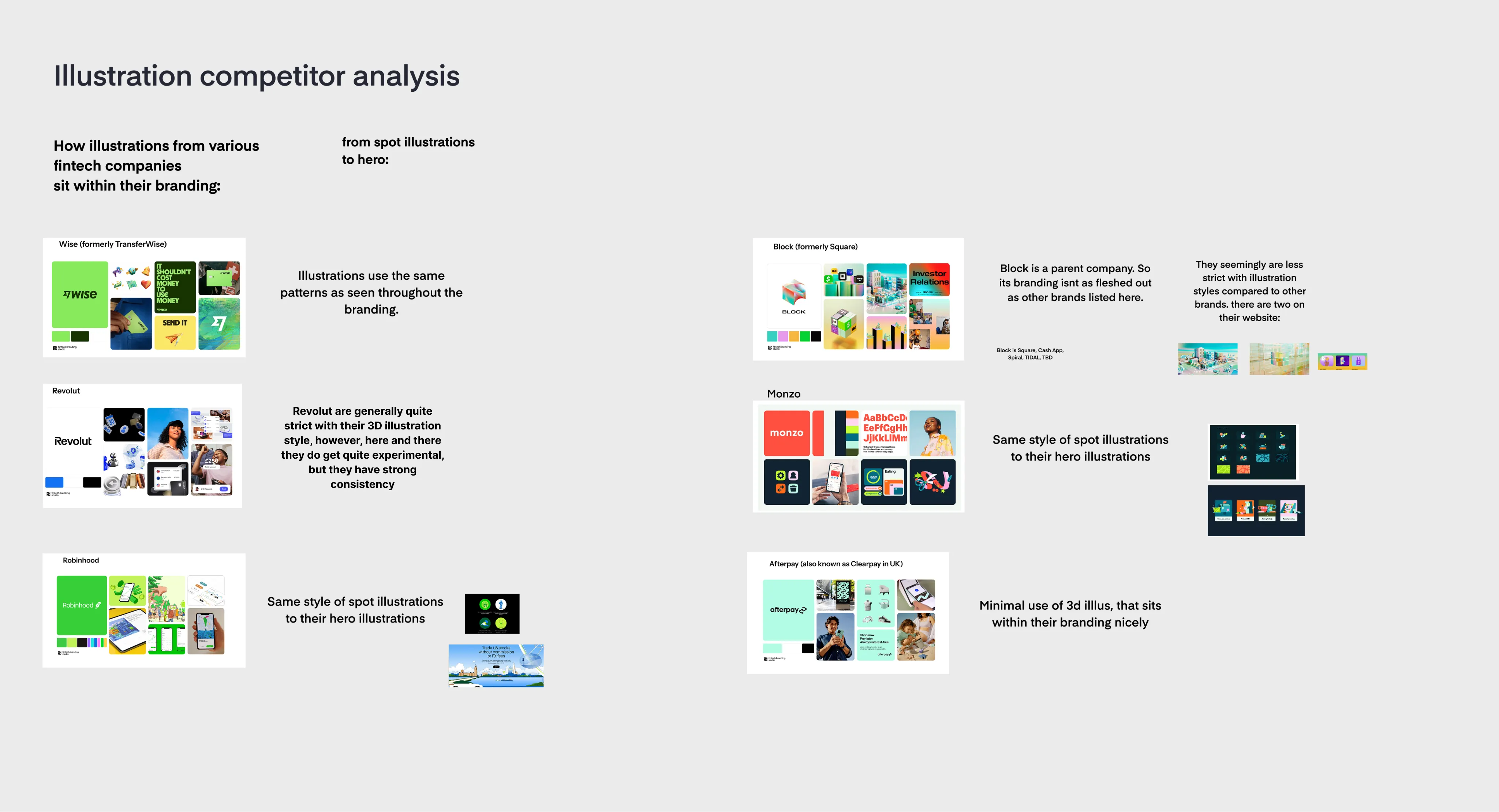
Drawing on my background in illustration, I designed and rolled out a bespoke set of spot illustrations, giving Equals genuine brand ownership and instant recognisability. It's no coincidence that every category-leading fintech brand - Wise, Monzo, Revolut - leans heavily on a distinctive illustration system. It's become a defining feature of the modern fintech identity, and now Equals has its own.

DIGITAL / PRODUCT DESIGN
MY ROLE
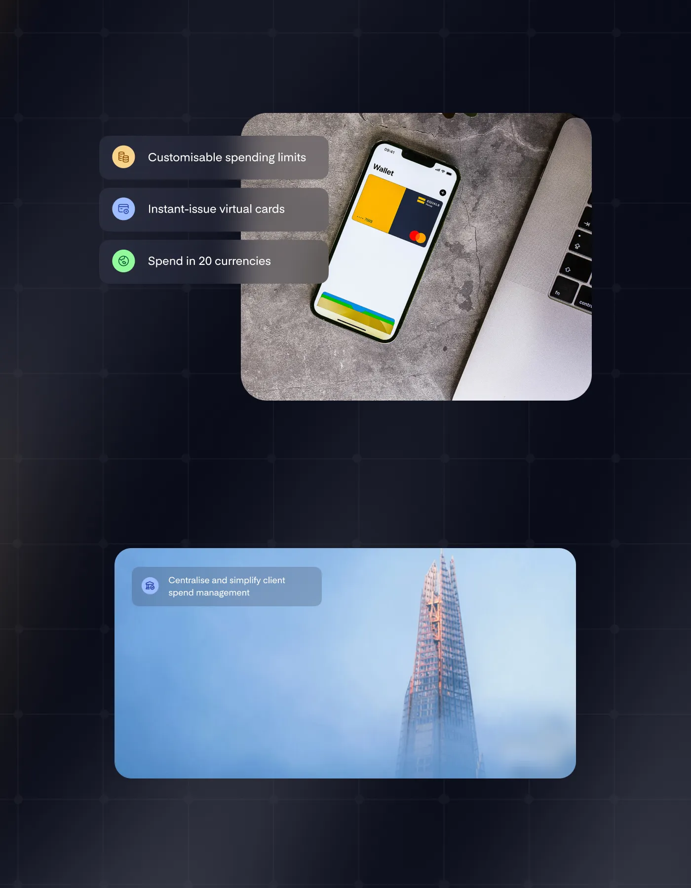
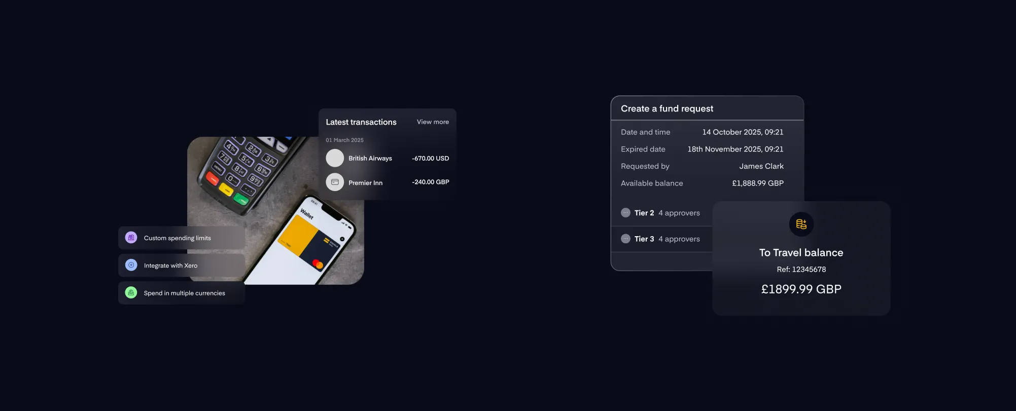
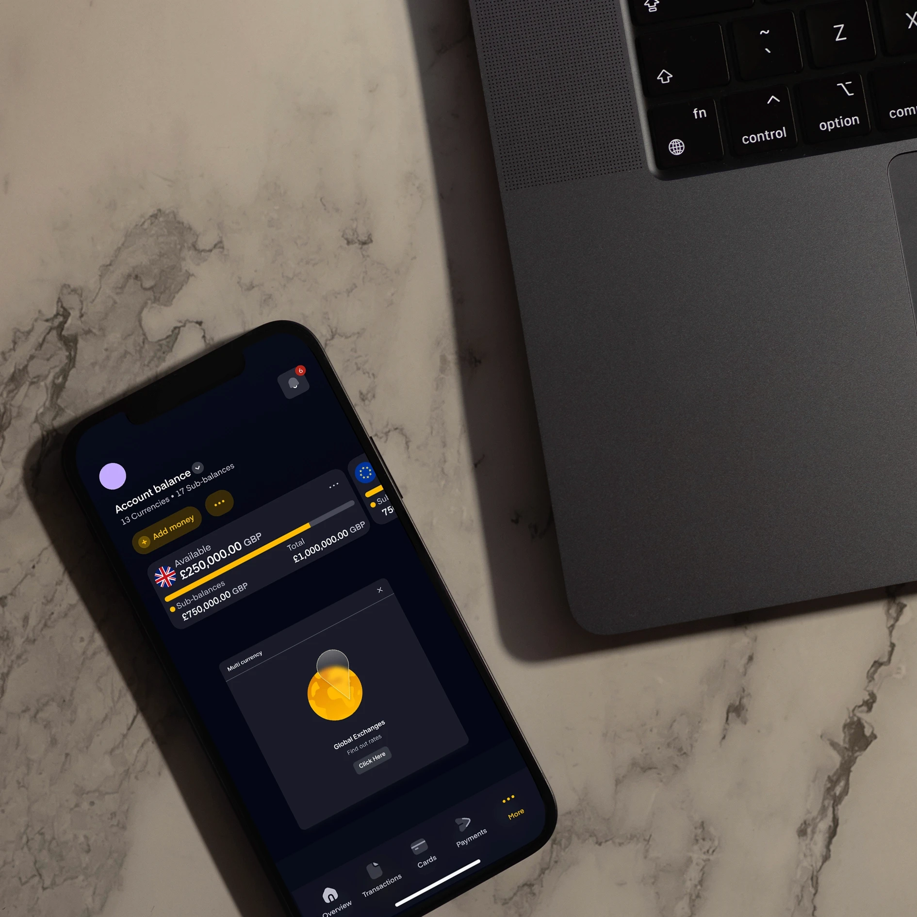
The identity system had to work seamlessly across our product experience. I developed a glassmorphic design language alongside the product team, creating a distinctive visual approach that set Equals apart in the fintech space. I refined and unified the colour palette across all product interfaces to match the brand guidelines, ensuring consistency at every touchpoint. Most critically, I embedded the new illustration system throughout the product—from empty states to onboarding to account management—creating a cohesive, recognisable experience that reinforced the brand at every interaction.



cOMPETITOR ANALYSIS


Outcomes
I helped design, build and market systems across Equals. The company scaled to £283M valuation, 4x when I started in 2022.
My work fundamentally shifted brand perception: share of voice climbed, reviews improved, and I transformed the company from a fragmented identity into a cohesive system where every touchpoint speaks the same language. The result is a brand that performs commercially and feels unmistakably Equals.
The Rebrand
A glimpse of the next chapter.
MY ROLE
I played a key role in shaping the strategic evolution of Equals' fresh, bold visual identity, establishing a scalable brand system across product, marketing and digital experiences.