Medexpress
A brand needs to feel as dependable as the service itself

SERVICES
BRAND STRATEGY
ART DIRECTION
Client
Medexpress Ltd
Location
cambridge, east anglia, LONDON, uk
Year
2025
Info
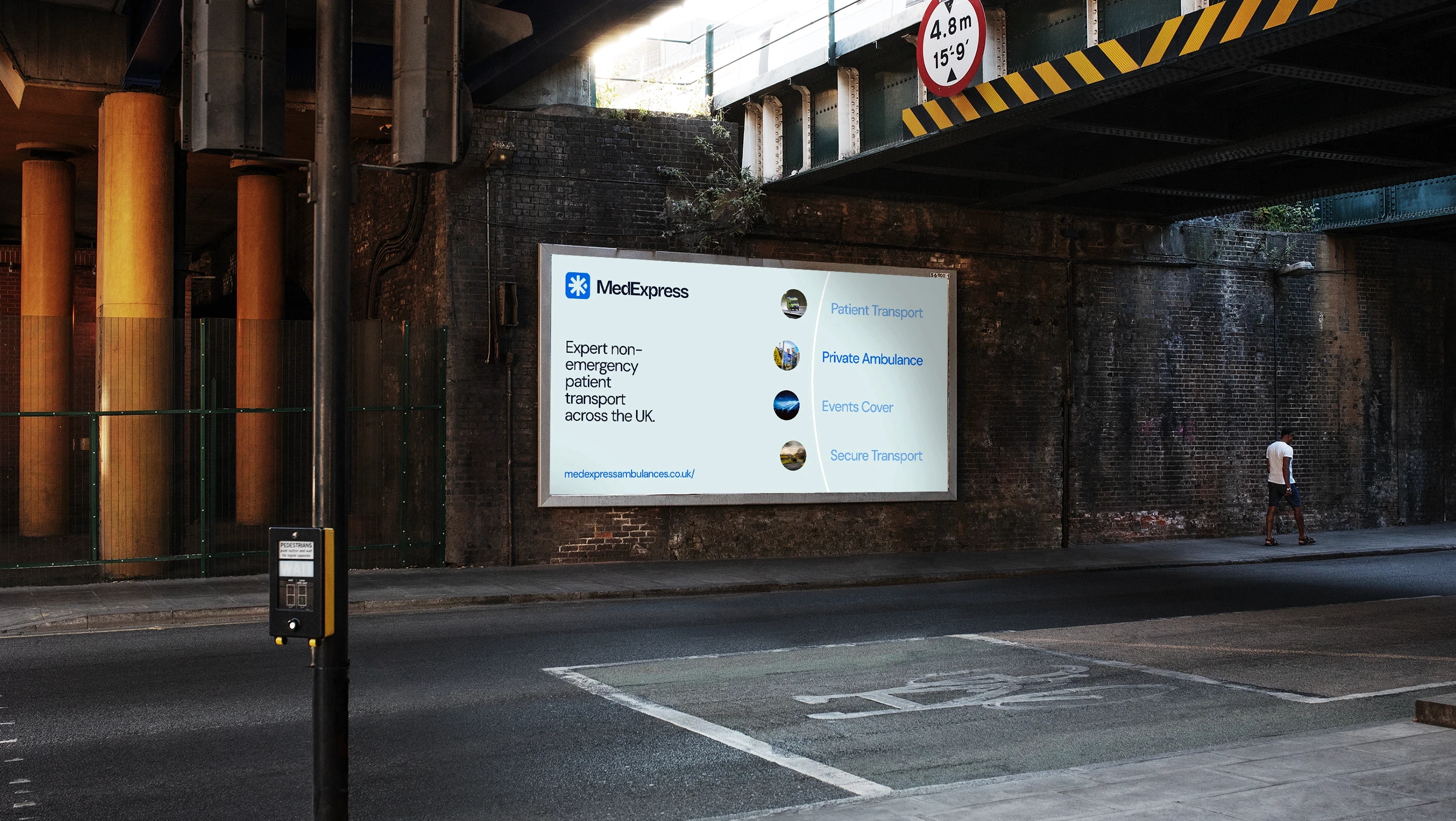
MedExpress move people when it matters most, and the brand needed to reflect that quiet sense of trust. I led the identity work end to end, shaping a logotype, signage, uniform marks, website, and guidelines that feel human, dependable, and unmistakably clinical in the best sense of the word. The result is a brand that travels well, on a uniform badge, a waiting room sign, a booking screen, or the website itself, and meets every patient with the same reassurance.
impact
brand identity and digital presence from scratch for one of the UK's last analog healthcare success stories.

my role: behind the work
PROBLEMS MEdexpress FACED
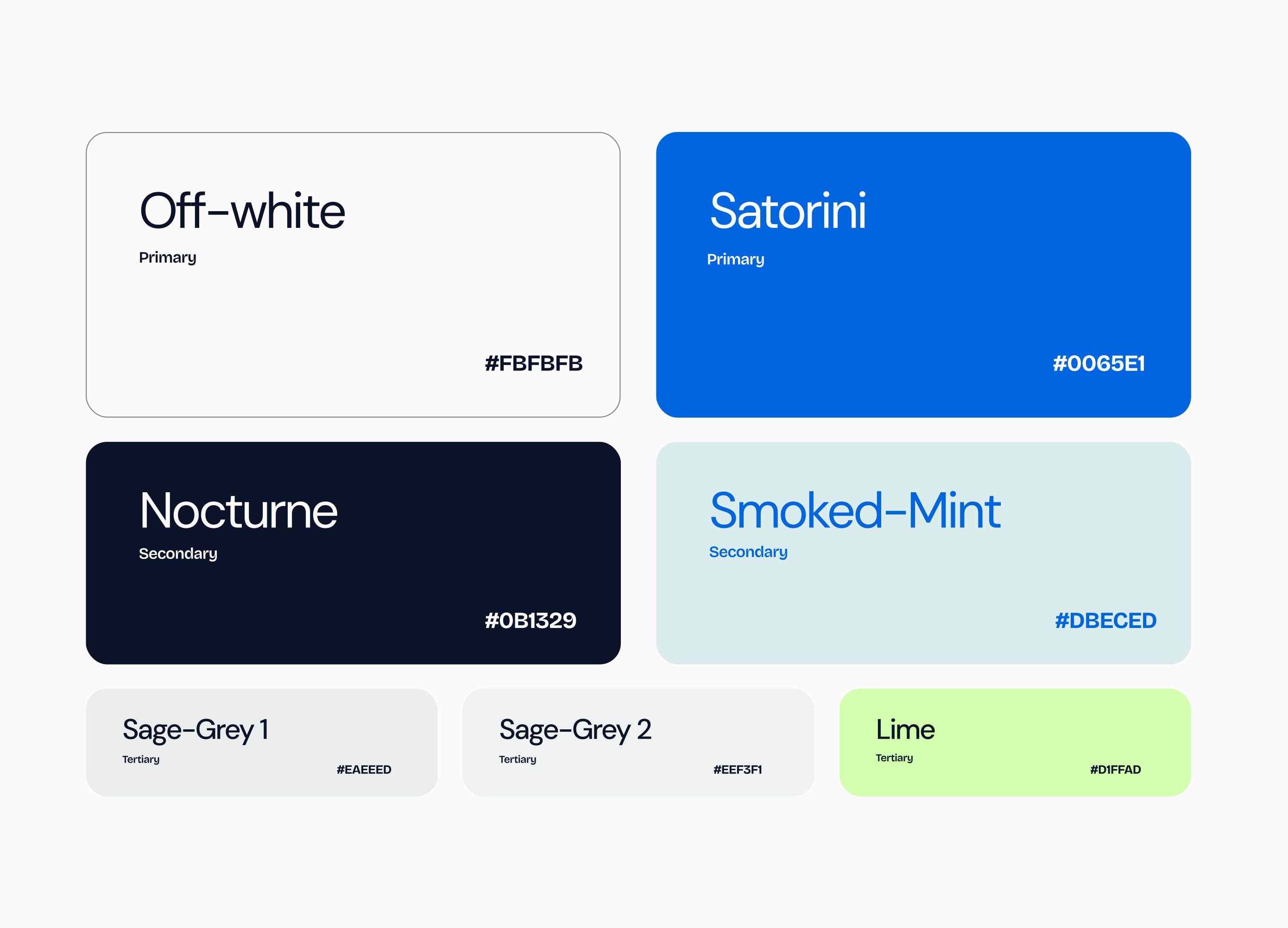
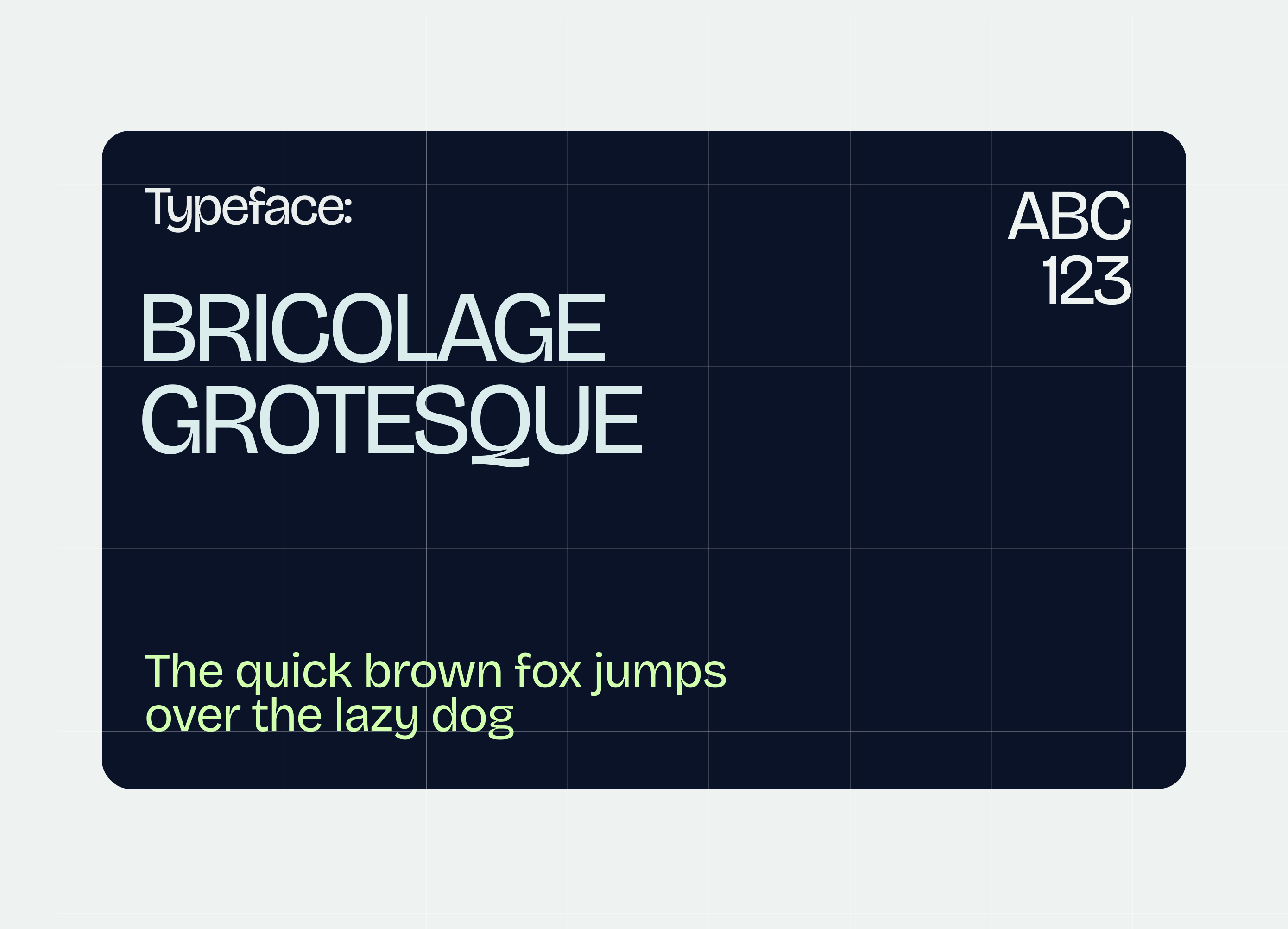
MedExpress is one of the last great analog success stories in UK private healthcare. For decades, the business thrived on word of mouth, clinical excellence, and long standing private healthcare relationships that didn't require a logo or a website to function. But over the last ten years the sector has grown rapidly, with digitally native operators like emed entering the market and reframing what a modern healthcare logistics brand could look like. MedExpress had the experience, operational depth, and clinical credibility, but none of the visual or digital presence to match. This is where I came in. I built the MedExpress brand identity and digital presence from the ground up: a complete visual language, a confident new logo system, a dependable typographic and colour world, photography direction, and a cohesive digital experience designed to mirror the calm, competent, premium feel of the service itself. The output gave a quietly excellent operator the public face it had always deserved.

campaigns worked on
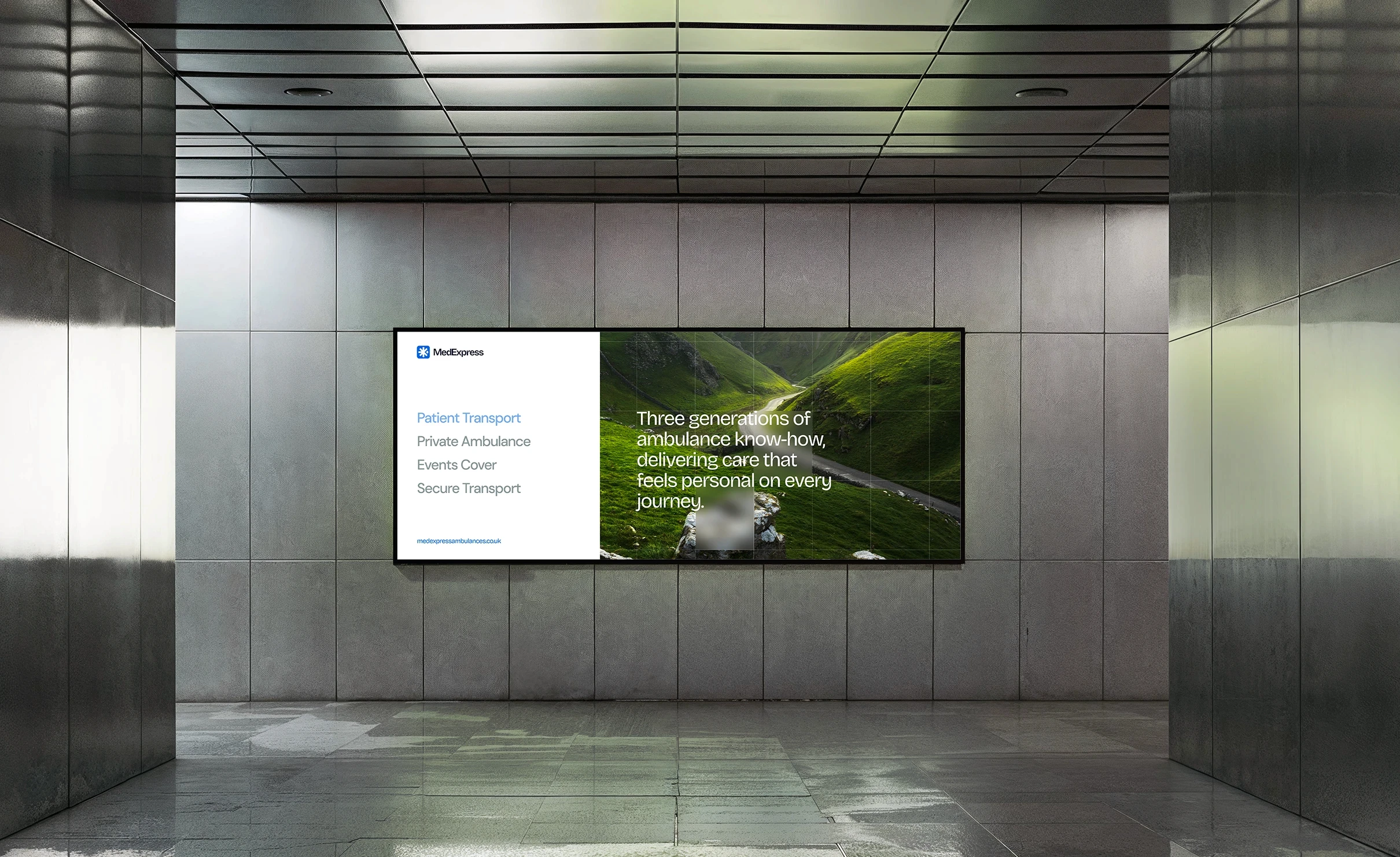
I led the strategy and execution of MedExpress's first integrated campaign work, translating decades of operational excellence into a brand presence the wider healthcare industry could actually see. The flagship campaign positions MedExpress as the patient first alternative in UK private patient transport, built around the company's three generations of ambulance know how and anchored in the line "from the first phone call to the final handover" — communicating that the calibre of care defines every touchpoint, not just the moment of transit. The work has already opened meaningful doors, including a recent partnership with Bupa, validating MedExpress's positioning as a premium, trusted partner to the UK's leading private healthcare networks. The campaign runs across digital, trade, and on the ground channels, steadily building public visibility in a sector where reputation has traditionally moved slower than the work that earns it.
Outcomes
The work transformed MedExpress from a respected but largely invisible operator into a brand that competes confidently on appearance, credibility, and digital presence. The new identity has directly supported the business in winning new contracts, including the high profile partnership with Bupa, and has opened conversations across the private healthcare sector that simply weren't possible before. Beyond the wins, the brand now feels coherent. Every touchpoint, from the website to the vehicles, the uniforms, the campaign work, and the wider digital presence, speaks the same language and delivers the same promise: dependability, expertise, and patient first care. MedExpress now looks every bit as serious as the service it has been quietly delivering for three generations.