hearken therapy
A considered identity for modern psychotherapy
Services
brand design
art direction
brand strategy
Client
Hearken Therapy
Location
bath, LONDON, uk
Year
2025
Info
Hearken approached me to build a brand that made psychotherapy feel considered and accessible. I developed the full identity, designed and built the website, and shaped the marketing presence from the ground up. the founder wanted quiet echoes of Greek philosophy woven in. which we honoured through subtle illustrations and in content through communications.
impact
A complete brand creation, from name to system to live digital presence, for a startup entering one of the most saturated wellness categories.


my role: behind the work
PROBLEMS HEARKRN FACED
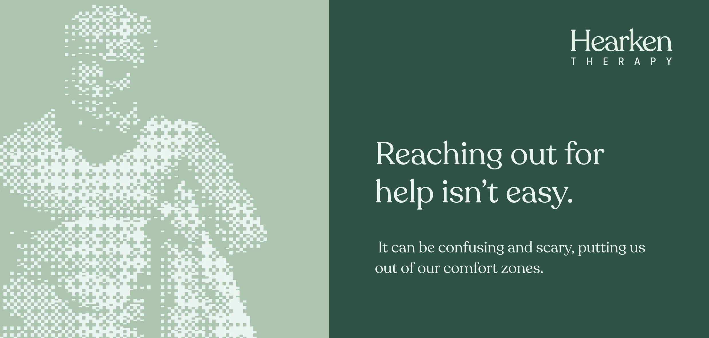
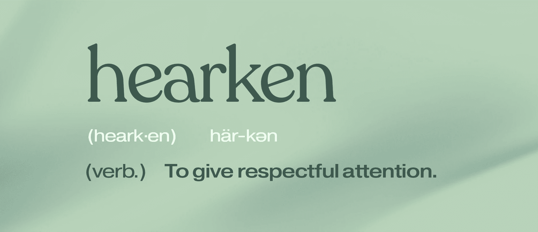
Hearken didn't have a brand problem when I came in. It didn't have a brand at all. The therapy and wellness space is one of the most crowded categories in modern lifestyle, and to launch a new entrant without a recognisable identity would have been to launch invisibly. I built the brand from the ground up, starting with the name itself, an archaic verb meaning "to give respectful attention," chosen because it carried a quiet authority the rest of the category lacks. From there I developed a complete visual system designed to feel trustworthy and human at once: a serif led wordmark in Recoleta, a sage and forest green palette, a halftone texture system that softened classical photographic references, and a tone of voice that meets people where they are rather than performing wellness at them.


Campaigns worked on
Hearken Therapy was a brand I created with the founder from the ground up, so the launch work focused on giving the business a clear, ownable position in one of the most saturated categories in modern lifestyle. I built the launch strategy around a single anchoring insight, "reaching out for help isn't easy", positioning Hearken not as another therapist directory but as a calm, considered space for people taking the difficult first step. The channel mix was deliberately focused: organic social, founder led storytelling, targeted digital, and community partnerships, designed to build trust at the rate that wellness brands actually earn it. Every touchpoint reinforced the meaning of the name itself: to give respectful attention.
Outcomes
The brand now exists as a complete, ownable system: a verbal and visual identity, a live digital presence at hearkentherapy.co.uk, and a strategic foundation the business can scale against. Hearken sits in the therapy and wellness space with a distinct point of view and the visual confidence to back it up, something most early stage wellness brands take years to develop, if they ever get there at all. Early signals are encouraging: a measured climb in inbound interest, growing engagement, and the kind of organic momentum that healthy therapy brands depend on. Hearken now looks and feels like a brand built to last, not a startup playing catch up.